If you’re thinking about getting a tattoo on the top of your shoulder, you picked a really nice spot to work with. It’s one of those areas that can look super elegant or bold, depending on what you do with it—and you still have the option to cover it up when you want. The curve of the shoulder makes a beautiful canvas for florals, script, butterflies, or more graphic pieces that move naturally with your body.
Think of this as the kind of breakdown you’d get sitting in the studio: what actually works well here, how to place it so it flatters your shape and fits your lifestyle, and what to expect with pain, healing, and long‑term care.
Why a Top-of-Shoulder Tattoo Works So Well
The top of the shoulder hits a sweet spot between visible and easy to hide. You can show it off with tank tops, off‑the‑shoulder pieces, or dresses, and then throw on a T‑shirt, blouse, or jacket and it disappears. On top of that, the natural curve of the shoulder tends to flatter a lot of different body types.
Recommended Products

The dolman sleeve shirt is made of soft, stretchy fabric, which is lightweight, breathable, and comfortable to wear. The 3/4 sleeve length is suitable for the gradually cooling weather of spring and autumn.

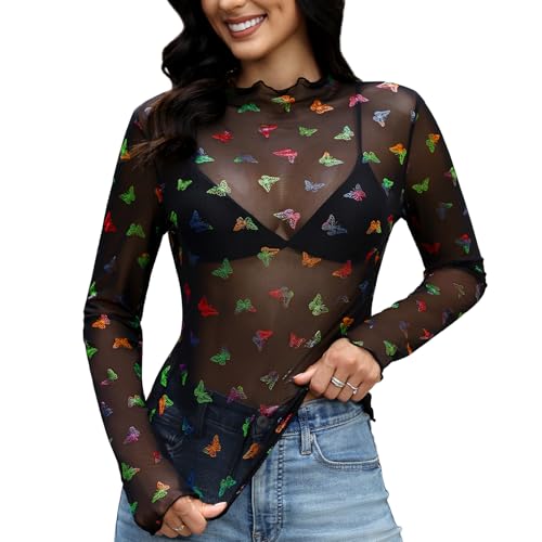
⚡High Quality Long-Lasting Sexy Flower Temp Tattoos for Womens -- look spectacular 24/7 for longer as our tattoos will last for several days. These sexy fake tattoo can show your personality and express your ideas.Guaranteed to dazzle, our black tattoos stickers are perfect for women girls to get noticed wherever you are.

【Black Flower Chest Temporary Tattoos for Women】A pack of 10 sexy and fresh tattoo stickers with different patterns, each size is 5.43*9.44 inches, including mandala flower branch butterfly tattoo stickers, which look sexy and mysterious,perfect for girls who want to try a fresh tattoo style.
Why this placement is especially nice for women
The shoulder cap follows a curve that can:
Soften broader shoulders
Highlight your collarbone and neckline
Add a bit of length visually to the neck and upper body
Smaller to medium designs—like florals, script, or a single bird or butterfly—sit really nicely when they follow that curve instead of fighting it. You can wrap the design a little bit toward the front of the shoulder or slightly onto the upper back so it flows in photos and looks great when you move. Pain here is usually moderate for most people; there’s more flesh than, say, ribs or spine, which helps if you’d prefer a less intense session.
Recommended Products
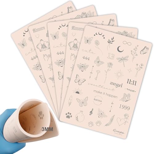
3MM Tiny Tattoo Practice skin Made from high-quality materials, it is closely mimic the texture and feel of real human skin. This gives you a realistic experience, allowing you to refine your skills before working on actual clients

Premium Quality 1.5mm Silicone Material – Crafted from premium 1.5mm thick silicone, this tattoo skin offers a true-to-life feel with excellent durability and a smooth surface for effortless needle movement during practice.
100+ Pre-Printed Designs – Features a wide variety of fine line and tiny tattoo stencils to enhance detailing skills.
Show it off or keep it low‑key
How much you show is basically up to your wardrobe:
Tank tops, camis, off‑shoulder and one‑shoulder tops: tattoo’s on display
T‑shirts, shirts with sleeves, light scarves: tattoo’s mostly hidden
If you know you’ll need to hide it sometimes (work, family, events), keep that in mind when deciding size and orientation. A more compact, circular, or vertical piece tucks under most sleeves better than a really wide horizontal design. If you want more discretion, staying closer to the highest point of the shoulder cap—rather than dropping down the arm—is usually the safest bet.
Recommended Products

【Graceful Floral Design】This set showcases realistic lily flowers with soft detailing and graceful proportions. Created for waist, shoulder, and half-sleeve placement, the designs highlight natural curves with a gentle, romantic feel. Elegant and timeless, these floral tattoos add a touch of beauty without feeling overpowering.

orange floral print swim dress for women: This one-shoulder bathing suit combines the design of a swim dress and functions of a pinup one piece swimsuit to make you more fashionable and flattering.

【Stunning and Unique Designs】12 sheets of large black flower temporary tattoos are nice ornaments and body markers for adults to stick on the arm, hand, shoulder, leg, and other body parts. They add a touch of sophistication to the body and make a versatile fashion accessory that makes you confident and beautiful.
Symbolism without going full chest piece
Top‑of‑shoulder is a nice compromise if you want something close to the heartline and collarbone but don’t feel like getting a chest tattoo. A lot of people choose this spot for things that carry big personal weight: small portraits, important dates, heritage symbols, or emblems tied to major life shifts.
Depending on size and contrast, it can read:
Very intimate and subtle (fine line, smaller scale)
Or more like a visible statement piece (heavier blackwork, bolder color)
That’s why it’s important to match the imagery and color to how you want the tattoo to “speak” when people see it—soft and quiet, or obviously intentional.
Recommended Products

Alternative Clothes for Women, Emo Clothes, Grunge Clothes for Women, Witchy, Gothic Clothes for Women, Grunge Clothes, Witchy Clothes for Women, Concert Tops

【Package Include】Each package including 30 sheets butterfly temporary tattoos sticker, 126 pcs in total, there are different colors and styles to choose from, used for arms, shoulders, back, legs and any other part of your body
Material: This mesh top is made from 90% Polyamide and 10% Elastane, is designed for ultimate comfort. Its lightweight and breathable material provides a soft touch against the skin, ensuring you stay comfortable all day long, whether you're at work or enjoying a night out
Popular Top-of-Shoulder Tattoo Ideas for Women
Here are some design directions that tend to sit really well on the top of the shoulder and play nicely with clothes, body shape, and meaning.
Recommended Products

💕【63 Sheets Flower Temporary Tattoos For Women Girls】--VANTATY 3D Realistic Rose Peony Temporary Tattoos For Adults Women Kids Adults Girls Body Art Stickers Look Real! 【Click Our Store/Brand Name To See More Fashion Designs】Dandelion Moons Sunflower Spider Tribal Wolf Lion Tiger Owl Animals Skull Skeleton Sexy Tattoos Butterfly Elephant Dreamcatcher Whale Crown Sea Weave Snake G angster Feather Birds Tattos infinity Bat Ghost Crown Dragon Scorpion Anchor Cross Compass.

Large Size: The full arm tattoo is 22.83 inches (58CM) long, covering the whole arm very well

【Black Flower Temporary Tattoos for Women】There Are 10sheets 3D Black Rose Flower tattoo stickers in one package, size is 8.3*4.7 inch & 5.5*2.67 inch, you can used these tattoos for arms, shoulders, back,chest, legs,neck and worn any where on your body.
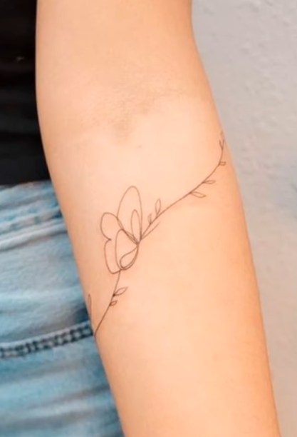
Floral patterns
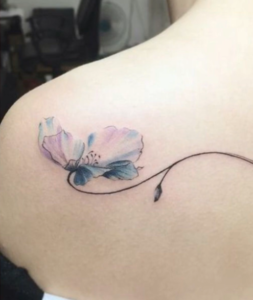
Florals and shoulders are a classic combo for a reason—they follow curves naturally. You can go from a single stem to a small bouquet that tracks along your collarbone and shoulder cap.
A few ways to place them:
A rose or peony facing slightly forward, pulling the eye toward the collarbone
Smaller blossoms trailing along the top curve of the shoulder
A cluster that starts on the shoulder cap and hints toward the upper back
Style options:
Fine line for something lace‑like and delicate
Full color for realism and depth
Soft shading and gradients to help the petals “sit” nicely on rounded skin
Meaning‑wise, you can be as intentional as you like—roses for love, chrysanthemums for resilience, lilies for renewal, or your birth flower. A quick chat in the studio about scale and flow goes a long way; you want the petals and stems to move with your shoulder instead of cutting across it awkwardly.
Minimalist ink
If you like things simple and low‑key, minimalist work on the top of the shoulder can look incredibly clean. We’re talking thin lines, tiny symbols, small bits of geometry—just enough to make a statement without shouting.
Common picks:
Small arrows
Crescent moons
Tiny triangles or linework shapes
Micro botanicals or initials
These sit nicely right on or just above the shoulder cap. They tend to heal fast and are great for first‑timers or anyone who wants something that tucks easily under a shirt. Because we’re working with very fine lines, you’ll want an artist who has healed photos of similar work—thin lines on curved, mobile areas need a steady hand and correct needle choice.
Minimalist pieces can also be a starting point: you can always build off them later into a partial sleeve or back/shoulder composition. Keeping them small relative to the shoulder helps them stay elegant instead of looking like they’re floating with no context.
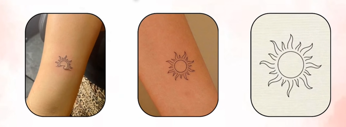
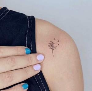
Butterfly art
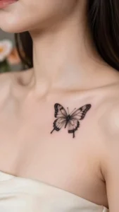
Butterflies sit beautifully on the top of the shoulder because they bring symmetry and movement. Positioned right, they can look like they’re about to lift off or just landed on your skin.
Placement ideas:
Centered so the body of the butterfly lines up with the shoulder seam
Angled so it “flies” toward the collarbone
Slightly tilted toward the back for a more subtle read from the front
Style options:
Realistic wings with soft color gradients
Dotwork or fine‑line outlines for something airy
Watercolor for bright, painterly wings
Bold blackwork if you want strong contrast and longevity
Different species and styles carry their own vibe—monarchs are often tied to transformation, swallowtails feel graceful and elegant, and stylized butterflies can be blended with florals or initials. One thing we always plan around is wing span and muscle movement so the shape still looks right when you lift or rotate your arm.
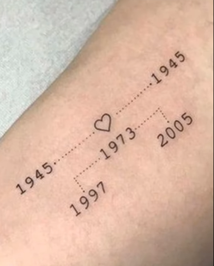
Script and quote tattoos
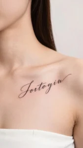
Script on the top of the shoulder can look very refined when it follows the collarbone or curves along the shoulder line. This placement works best for short phrases, single words, or dates—enough to say something without wrapping halfway down your arm or back.
Key choices here:
Font style:
Cursive/handwritten for romantic or personal lines
Typewriter/serif for a more literary or formal feel
Size: big enough to stay readable once it heals and softens a bit
A good move is to have your artist mock the text on a photo of your shoulder first. That way you can see how spacing, letter height, and curve sit with your anatomy before anything permanent goes on. Small tweaks in kerning or angle can completely change the feel.
Recommended Products

▶ Henna Tattoo Kit: 16 sheets tattoo stencils. airbrush tattoo stencils suitable for tattoo lovers. Experience the effects of tattooing without the pain of tattooing.

INCREDIBLE VALUE – 524 Unique Designs: This henna tattoo kit includes 20 stencil sheets with 524 patterns, featuring butterflies, florals, symbols, lettering, totems, and Egyptian-inspired designs. These henna stencils let you mix, match, and layer for custom henna temporary tattoos on hands, arms, and body. A refillable pen with a soft nylon tip is included for precise lines and varied strokes (pen does not include ink)

【 575+ Fun Assorted Tattoo Stencils 】-The ChurlChurl tattoo stencils collection includes 575 high quality stencils with multiple themes. enjoy cute trendy tattoo stencil designs like butterflies, words, flowers, symbols, totem, Egypt style patterns and more.
Styling and Placement Inspiration
This is where design meets your actual life—how you move, what you wear, and how you want the tattoo to show up in all of that.
Flowing across the collarbone
If you like the idea of your tattoo drifting a little onto the chest, a collarbone flow can be really flattering. The trick is to elongate the area, not crowd it.
Nice options here:
Floral stems that start on the shoulder and taper across the clavicle
Script that gently arcs along the collarbone
Thin, minimal geometric lines that echo that natural curve
We usually angle the design to follow the slope from the high point of the shoulder toward the center of the chest. That keeps things dynamic and graceful instead of blocky. Near the collarbone itself, narrower elements tend to look better; the more solid parts of the design sit back on the shoulder cap where there’s more space.
Clothes matter too—scoop necks, off‑shoulder tops, and certain bra straps can frame or cut through the tattoo. A quick stencil or marker layout in the studio while you move your arms and adjust your top is the best way to see how it’ll really live on your body.
Recommended Products

Magenta floral swim dress for women: This one-shoulder bathing suit combines the design of a swim dress and functions of a pinup one piece swimsuit to make you more fashionable and flattering.

⚡Awesome Realistic Flowers Temporary Tattoos for Women -- Super stylish design temporary tattoos, set includes variety of sizes that you can use for different locations on your shoulder, arms, chest, etc. Easy to share it with your family and friends.

💕【65 Sheets Flower Temporary Tattoos For Women 】--VANTATY 3D Realistic Floral Rose Peony Temporary Tattoos For Adults Women Kids Adults Girls Body Art Stickers Look Real! 【Click Our Store/Brand Name To See More Fashion Designs】Dandelion Sunflower Birds Lotus Mountain Wolf Snake Sea Weave Animals Tiger Skull Skeleton Lion Crown Spider Spiderweb Bat Dragon Scorpion Anchor Pirate Butterfly Compass Triangle Geometric dolphin Elephant Tattos Indian Feather Bowknot.
Extending down into the upper arm
If you think there’s a chance you’ll want more ink later, planning to let the shoulder design spill a bit onto the upper arm is a smart move. It gives you room to eventually turn it into a half sleeve or a more complex piece.
Things that help:
Letting the design curve around the deltoid instead of staying totally flat
Using connectors—vines, dotted lines, or small bands—to bridge shoulder to bicep
Deciding whether you want the main read from the front, side, or back
Pain‑wise, the outer upper arm is one of the more comfortable places to get tattooed and usually heals predictably. The inner arm is more sensitive and can blur fine detail more easily, so that’s something to factor in when choosing how far in you go.
Recommended Products

Off shoulder Sweatshirts for Women Round Neck Slouchy Shiny Letter Print Casual Loose Pullover Shirts

This sexy off shoulder top can be worn off either shoulder or centered for just a peek of both Ideal for parties or casual wear

【77 SHEETS/LOT】It comes in bigger and smaller sizes, size 7.48 * 3.74 in (19 * 9.5 cm) * 17 pieces, small lovely tattoo stickers size 3.85*2.28 in (9.8*5.8cm) *60pieces. These tattoos also can be on some smooth objects, like glass, cups, phone cases, etc
Connecting with back tattoos
If you already have a back piece or know you want one, it’s worth planning the shoulder and back together from the start. That way, it feels intentional and not like two separate tattoos that happen to be near each other.
Ways to tie them together:
Repeat certain motifs, line weights, or shapes
Use small connectors (a fine line, tiny stars) for a subtle link
Or go bold with a sweeping floral, vine, or geometric bridge
We’ll usually test placement with a temporary stencil and have you sit, twist, reach, and move so you can see how everything behaves in real life. For bigger projects, it often makes sense to split the work into a few sessions to keep healing controlled and colors consistent.
Recommended Products
ALL-DAY COMFORT & SECURE HOLD: Our disposable nipple covers stay comfortably in place throughout the day with skin-friendly self-adhesive for reliable no-show coverage. For easier removal, simply moisten the edges before peeling off to help reduce discomfort, especially for sensitive skin.

⚡Realistic Black Floral Fake Tattoos for Women Girls -- Super stylish design temporary tattoos, set includes variety of elements(line,flower,leaves..) that you can use for different locations on your wrist, leg, arms, chest, etc. Easy to share it with your family and friends.

SIZE AND CARE: If you would like to know more size details, pls check our image of Size Chart; Please choose you normal size or smaller size if you are between sizes; Machine or hand wash with cold water; Do not bleach.Iron on low temperature
Personalizing Your Top-of-Shoulder Tattoo
Here’s where we dial it in so the tattoo actually feels like you—not just a design you saw online.
Recommended Products

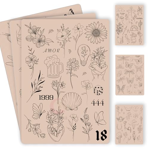
142+ Nature-Inspired Tattoos Stencil Designs in 12 Sheets: This temporay tattoo template set features over 142 unique, delicate designs centered on enchanting botanical and natural elements. Discover a vast collection of flowers (daisies, roses, sunflowers, lavender), intricate leaves, winding stems, complete bouquets, elegant wreaths, crowns, bees, and butterflies. Perfect for creating floral temporary tattoos, henna-inspired patterns, and nature-themed body art.

Product Kits: You will receive 12 A4 sheets featuring 142 unique henna tattoo stencils patterns including butterflies, flowers, words, symbols, totems and egyptian designs. Our versatile temporary tattoos adult with stencils collection offers something for every taste with its wide variety of artistic models.

INCREDIBLE VALUE – 281 Unique Designs: This extensive henna tattoo kit includes 281 diverse patterns suitable for full creativity across hands, arms, and body. Featuring mandalas, florals, paisley, and geometric motifs, these flexible henna stencils allow you to mix and layer styles freely. The collection of henna temporary tattoos ensures you always have the perfect design for festivals, parties, or personal expression
Choosing meaningful symbols
Start by jotting down personal anchors:
Birth months or birth flowers
Travel coordinates or city silhouettes
Family initials or meaningful numbers
Plants you love or care for
Hobbies you live with every day
The goal is to pick symbols that still feel right years from now. Instead of just “a random flower,” maybe it’s a specific flower tied to someone important, or a compass with a date marking a turning point in your life. Popular motifs become much less generic when we add those personal layers.
On a curved surface like the shoulder, we’ll also simplify complex ideas into shapes that are clear and readable from a bit of distance. Strong silhouettes and good use of negative space help the design hold up as your skin and tattoo age.
Customizing colors
Color can make a big difference in how the piece sits on your skin and with your clothes. A few things to think about:
Your undertone:
Warmer skin often plays nicely with earthy reds, golds, olives
Cooler skin can really suit blues, teals, purples
Your usual wardrobe: bringing a few outfit photos to your consultation never hurts
In terms of longevity, blacks and deep navies hang in there the longest. Pastels, very light yellows, and pale pinks tend to fade faster, especially in areas that see more sun. Saturated accents and darker outlines are great for keeping things readable long term.
We’ll also talk about where the brighter colors sit—if part of the tattoo is going to live under a sleeve most of the time, that’s a better place for delicate colors than the exact spot that gets full sun every day.
Size and shape that suit your shoulder
When we’re sizing for the top of the shoulder, we’re not just looking at a flat photo—we’re looking at how it moves when you lift your arm, reach forward, or twist.
Some quick guidelines:
Horizontal designs tend to follow the clavicle nicely and work well with off‑shoulder and wide‑neck tops
More vertical or diagonal pieces can make the arm and shoulder look longer and pair well with sleeveless styles
Intricate mandalas or highly detailed scripts usually need more space to stay crisp
Rounded or softly curved designs often sit best on the roundness of the deltoid, while sharper, more angular designs can be used to emphasize muscle lines if that’s the look you like. If you think you’ll want to add more tattoos later, we can leave breathing room and connection points so everything ties together without looking crowded.
Pain Level and Healing: What to Expect
On the top of the shoulder cap itself, most people describe the pain as a steady scratch or burn—noticeable, but usually in the low‑to‑moderate range. When the needle gets closer to the collarbone or over bony, thinner‑skinned spots, you’ll feel sharper, more intense stings. Those moments are usually brief as the machine passes over those areas.
Longer sessions (past a couple of hours) can make you more tired and sensitive, so breaks help. A sleeveless or loose‑strap top is ideal so we’re not fighting fabric, and it’s best to avoid numbing creams unless we’ve talked about it first—some products don’t play well with tattooing. Coming in well‑rested, hydrated, and having eaten beforehand makes a big difference in how you feel in the chair.
Healing smoothly
For healing, the basics are simple but important:
Wash gently twice a day with mild, fragrance‑free soap and lukewarm water
Pat dry—don’t rub
Use a thin layer of the ointment or lotion recommended, then switch to light moisturizer as it starts to peel
Skip:
Pools, baths, hot tubs, long soaks for at least two weeks
Sleeping directly on that shoulder if you can avoid it
Tight straps or rough fabrics that constantly rub the area
Heavy workouts that stretch or strain the skin in the first week or so
Keep an eye out for signs of infection—spreading redness, heat, pus, strong pain that’s getting worse instead of better. If that happens, reach out to your artist or a healthcare professional.
Aftercare and Long-Term Maintenance
The first 2–4 weeks are about healing; everything after that is about keeping it looking good. Follow the aftercare instructions from your artist first—they’ll have tailored them to your skin and the specific inks used.
General long‑term tips:
Keep moisturizing even after it’s fully healed; healthy skin = better‑looking tattoos
Protect it from the sun with SPF 30+ once healed
Avoid constant friction from heavy straps and bags if you can help it
If you ever notice the lines softening or color looking a bit tired a few years down the line, a quick touch‑up can bring it back to life.